20+ Years Experience
Specialist Aluminium Shopfronts

A well-designed shop front is crucial for a stationery store, as it not only attracts customers but also creates a lasting impression. Reflecting the brand identity and values, the design should consider factors such as location, target audience, and surrounding environment.
From bold colours to playful elements, there are numerous creative ideas to enhance the storefront. To maintain a visually appealing shop front, regular cleaning, seasonal decorations, and periodic design updates are essential.
Speak to our shopfront experts for more information on stationery shopfront design.
The shop front design of a stationery shop plays a crucial role in setting the tone for the entire shopping experience, creating a visual identity that entices customers and communicates the brand’s essence.
A well-thought-out frontage not only serves as a physical representation of the brand but also acts as a silent ambassador, speaking volumes to passersby about the quality and uniqueness of the products inside.

Elements like the colour scheme, lighting, and overall layout can greatly influence a customer’s decision to enter the store. For instance, a clean and organized storefront with eye-catching displays can draw individuals in, while outdated or cluttered designs may deter potential customers.
Strategic placement of signage and window displays can effectively guide foot traffic and highlight featured merchandise, encouraging impulse purchases and prolonged browsing.
An aesthetically pleasing and well-thought-out shop front design for a stationery shop has the power to attract customers and draw them into the store, setting the stage for a memorable shopping experience.
The design of a shop front serves as the first point of contact between the business and potential customers, acting as a visual representation of its identity and values. By incorporating elements such as colours, signage, and branding, a shop front can communicate the essence of the stationery shop to passers-by, enticing them to step inside.
The use of effective lighting can enhance the shop’s visibility and create a warm and welcoming ambience, making it more accessible and inviting. A unique and eye-catching shop front design can distinguish the stationery shop from competitors, making it more attractive and memorable in the minds of shoppers.
The shop front design of a stationery shop serves as the initial point of contact with customers, making it essential for creating a positive first impression that resonates with the brand’s identity and values.
It’s crucial for the design elements of the shop front to align seamlessly with the overall branding strategy, ensuring consistency in colours, fonts, and imagery that reflect the essence of the stationery shop.
A well-thought-out colour scheme can evoke emotions and set the tone for the customer experience even before they walk through the door. Strategic lighting placement can further enhance the visual appeal of the storefront, drawing attention to key areas and creating an inviting atmosphere.
The placement of the logo on the shop front plays a vital role in reinforcing brand recognition and leaving a lasting memory in the minds of customers.
A well-executed shop front design for a stationery shop should seamlessly reflect the brand’s identity, conveying its unique concept, values, and aesthetic through thoughtful design elements and branding integration.
Typography plays a crucial role in communicating the brand’s personality and message to passers-by. The choice of fonts, colours, and sizes can evoke different emotions and perceptions, shaping how customers perceive the brand. Materials used in the shop front design, such as reclaimed wood for a rustic feel or sleek glass for a modern touch, can further reinforce the brand’s image.
By implementing unique concepts like interactive displays or innovative signage, the shop front design not only captures attention but also creates a memorable experience for customers, driving engagement and loyalty.
Before embarking on the design of a stationery shop front, it is crucial to consider a range of factors such as the store’s location, target audience, and alignment with the brand’s image and values.
Understanding the location where the shop will be situated is essential for attracting the right customers. A thorough analysis of foot traffic, surrounding businesses, and local demographics can inform the layout and design decisions.
Profiling the target audience aids in creating a space that resonates with their preferences and purchasing behaviours. Ensuring that the shop front design aligns seamlessly with the brand’s identity through consistent branding elements, colour schemes, and messaging helps to establish a strong visual identity. Merchandising considerations play a vital role in maximising the use of space and showcasing products effectively.
The location and surrounding environment of a stationery shop play a significant role in shaping the design of the shop front, influencing factors like accessibility, aesthetics, and the overall vibe of the shop.
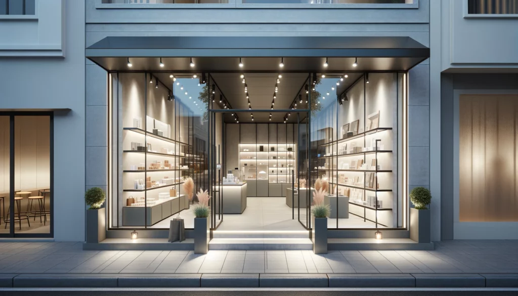
For instance, a shop situated in a bustling urban area might opt for a sleek and modern exterior design to attract the attention of passers-by, while integrating large windows to showcase their products. This creates a sense of openness and invites potential customers inside.
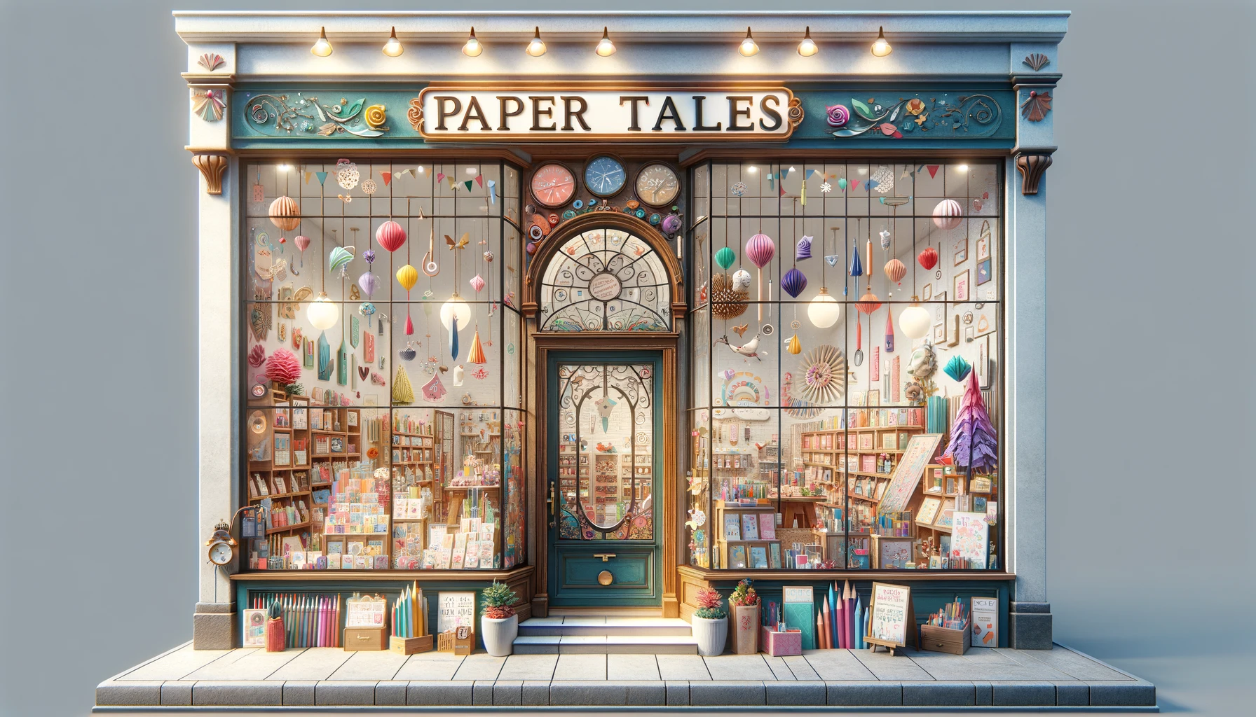
The interior layout integration is crucial in maximising the use of limited space in city settings, often prompting innovative solutions such as multi-functional furniture or flexible shelving systems. By balancing trendy design elements with cosy touches like warm lighting and comfortable seating areas, the shop can strike a harmonious balance between style and comfort, appealing to a diverse range of shoppers.
Understanding the target audience of a stationery shop is essential for tailoring the shop front design to resonate with their preferences, creating a charming and memorable experience that connects with the local community.
By incorporating personalised branding elements, such as custom logos and packaging, the stationery shop can establish a unique identity that speaks directly to the hearts of its customers. This attention to detail not only adds a touch of exclusivity but also fosters a sense of belonging and loyalty among shoppers.
Leveraging the local charm can further enhance the shopping experience by infusing elements of the community’s culture or history into the design, making customers feel a deeper connection to the place they call home. Niche appeal plays a crucial role in attracting specific segments of customers who seek products that align with their individual interests and styles, creating a specialised and curated shopping experience that resonates on a personal level.
The brand image and values of a stationery shop should be at the core of the shop front design, infusing elements of creativity, sustainability, and unique concepts that align with the brand’s overarching identity.
This alignment in design decisions not only enhances the visual appeal of the shop but also communicates a strong message to customers about the brand’s commitment to sustainability and innovation.
From the layout of the store to the choice of decor and signage, every detail should reflect the essence of the brand. By integrating sustainable materials, eco-friendly practices, and engaging displays, the stationery shop can create a cohesive brand experience that resonates with its target audience and sets it apart in a competitive market.
When exploring creative ideas for stationery shop front design, consider innovative approaches such as artistic product displays, incorporation of natural light and greenery, and interactive elements that engage customers and enhance the overall business image.
Engaging displays play a crucial role in drawing customers into the shop with visually appealing arrangements that showcase the diversity of products available.
Integrating interactive features like touchscreens for virtual browsing or creative showcases that allow customers to interact with the stationery in unique ways can create a memorable experience.
Incorporating elements of nature, such as plants or sustainable materials, not only adds a touch of freshness but also aligns with eco-conscious trends, resonating well with environmentally aware consumers.
These design concepts can help create a dynamic space that not only attracts attention but also fosters a sense of connection and engagement with the brand.
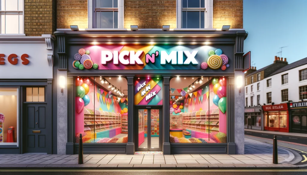
Incorporating bold and eye-catching colours in the stationery shop front design can instantly grab attention, adding a visual appeal that sets the store apart and creates a vibrant and inviting atmosphere.
These strategic colour choices not only attract potential customers but also contribute to setting the mood and tone of the shopping experience. By utilising a palette that conveys creativity and positivity, the storefront becomes an extension of the brand identity, resonating with the target market.
Bold hues like striking reds, vibrant yellows, and deep blues can evoke emotions and trigger curiosity, drawing passersby to explore what the store has to offer. Integrating a cohesive colour scheme throughout the interior design reinforces brand recognition and helps in establishing a memorable visual impact for the business.
Infusing unique and playful elements into the stationery shop front design adds a touch of creativity and charm, creating an inviting space that resonates with the brand’s identity and inspires customer curiosity.
The incorporation of whimsical details such as colourful hand-painted signage, quirky window displays featuring oversized paper clips and giant pencils, and an interactive wall where visitors can leave their mark with personalised doodles, all contribute to the shop’s enchanting ambience.

By weaving these unconventional elements into the design, the space not only stands out but also becomes a vessel of inspiration, sparking joy and wonder in those who step through its doors.
Artistically showcasing stationery products in the shop front design not only enhances the visual presentation but also showcases the merchandise in an organized and appealing manner that entices customers and encourages exploration.
By strategically arranging items in a way that is visually stimulating, retailers can draw the attention of potential buyers and create a memorable shopping experience. Utilising creative product displays can serve as a powerful marketing tool, effectively communicating the unique selling points of each item and increasing their perceived value.
Incorporating storytelling elements into the display can further engage customers and evoke emotions, making the shopping process more enjoyable and meaningful. Emphasizing colours, textures, and styles through thoughtful merchandising techniques can effectively highlight the stationery items, making them stand out amidst the sea of competing products.
Harnessing natural light and integrating greenery elements in the stationery shop front design not only enhances the aesthetic appeal but also promotes a sustainable and eco-friendly image that resonates with environmentally conscious customers.
The incorporation of natural elements in the shop front doesn’t just end at visual aesthetics. Natural light is not only more flattering for customers browsing stationery products but it also helps reduce energy consumption by relying less on artificial lighting.
Integrating green features like potted plants or living walls can enhance air quality inside the shop, creating a healthier and more welcoming atmosphere. This combination of creativity in design and eco-friendly initiatives not only establishes a positive tone for the business but also contributes to a more sustainable future.
Creating interactive and engaging shopfront displays for a stationery shop fosters customer engagement, showcases products effectively, and cultivates a dynamic business image that is not only captivating in-store but also social media-worthy.
These interactive displays provide a unique opportunity for customers to interact with the products in a hands-on manner, creating a memorable and personalised shopping experience. By incorporating elements such as touch screens, digital catalogues, and interactive games, the stationery shop can stand out among competitors and draw in a wider audience. This not only boosts footfall but also increases social media visibility as customers are more likely to share their interactive experiences online, further expanding the shop’s reach and appeal.
To uphold a well-designed stationery shop front, prioritise regular cleaning and maintenance, incorporate seasonal and holiday decorations for festive charm, and ensure timely updates and design refreshes to keep the storefront visually appealing and current.
Maintaining the cleanliness of your shop front is essential, as dust and dirt accumulation can detract from the overall presentation. Regularly dust shelves, wipe down surfaces, and sweep the entrance area to create a welcoming atmosphere for customers.
When transitioning between seasons, take advantage of themed decor elements such as window displays, floral arrangements, or seasonal signage to captivate passersby and showcase your shop’s adaptability.
Don’t overlook the impact of periodic updates to your signage, paintwork, or lighting fixtures, as these small changes can significantly enhance the overall aesthetic appeal of your storefront.
Regular cleaning and maintenance of the stationery shop front are essential to uphold a professional and inviting appearance that resonates with customers, reflecting a commitment to cleanliness and organisation that enhances the overall shopping experience.
By implementing a structured cleaning schedule, such as daily sweeping of the storefront, wiping down display surfaces, and organising merchandise shelves, a sense of order and tidiness is maintained.
Utilising welcoming signage and attractive window displays also contributes to the store’s visual appeal. Investing in high-quality cleaning products and training staff on proper cleanliness procedures ensures a consistent standard of cleanliness is upheld.
Ultimately, a clean and organised storefront not only attracts customers but also conveys a sense of professionalism and care for the shop’s image.
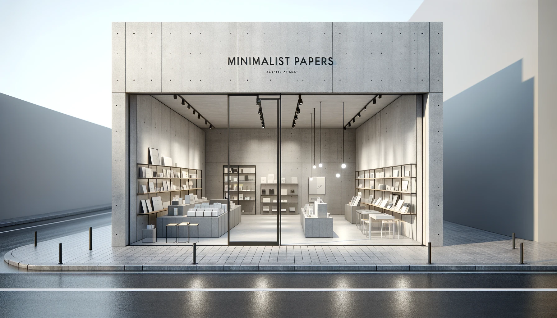
Incorporating seasonal and holiday decorations in the stationery shop front design adds a touch of charm and festivity, creating a memorable and inviting atmosphere that resonates with customers during special occasions.
The festive storefront not only captures the essence of the holiday season but also serves as a visual representation of the brand’s commitment to creating a magical shopping experience. By strategically placing twinkling lights, wreaths, and seasonal displays, the shop exudes warmth and joy, drawing shoppers in with a sense of excitement and anticipation.
The creative decor not only showcases the latest products but also inspires customers to embrace the spirit of the festivities, fostering a sense of connection and community within the store.
Periodically updating and refreshing the stationery shop front design introduces novelty and keeps the storefront visually attractive and trendy, appealing to evolving customer preferences and maintaining a dynamic brand image.
Design updates play a crucial role in adapting to changing market dynamics and ensuring that the storefront remains in sync with current design trends. By making strategic layout adjustments and incorporating seasonal decor changes, the shop can create an engaging atmosphere that resonates with customers.
These periodic refreshes not only enhance the visual appeal of the store but also demonstrate a commitment to staying relevant and responsive to the evolving needs of the target audience.
There are a range of other services that we can provide. Have a look at the list below for more information:




















We Aim To Reply To All Enquiries With-in 24-Hours